How I take my daily notes in Craft
edit: this is no longer accurate, but I’m leaving it for legacy purposes/posterity. Craft Docs also now has dates/todos as a first-class item.
I’ve used Evernote, Roam, Obsidian, Notion, Bear, Drafts, IA Writer, various Zettelkasten tools, and many other systems to try to organize all my notes. But none of them have worked for me like Craft.do has.
I can’t put my finger exactly on why it’s the winner, but it’s some combination of features, speed, visual appeal/distinctiveness, and customer-responsiveness. (The price point is great, too!)
I have three different workspaces:
- My second brain/public notes/digital garden (link)
- Personal notes & tasks (what we’re here to talk about today!)
- A shared space for home & family1
So, how am I handling my personal notes & tasks? Let’s dive in.
Considerations
I want notes to be easy-to-enter. I want them to accommodate both daily planning, ongoing note-taking, and tie-ins to project, people, or topic pages.
I like the idea of Leuchtturm’s 5-year journals, which give the ability to look back on what I was doing this day in previous years. But, for me, it’s hard for me to to keep a good habit of writing in them.
The Setup
I created a top level page (a “Document”, in Craft parlance) called “Dailies”. I made it one of my Starred Documents for easy access.
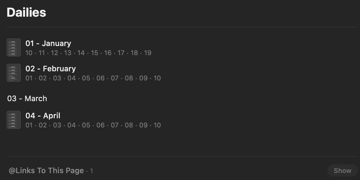
“Dailies” has sub-pages for each month. Each of those subpages has day subpages. Here’s what that looks like.

Let me explain a few things you’re seeing here.
First, sub-pages show a bit of their internal content, by default2. I didn’t start until the 10th of January, so that’s why you’ll see January’s first internal entry being “10”.
Second, you’ll see March is empty but April is not. This is because I created the April 1st entry ahead of time, because I have something planned (for April Fools). This is an intended feature of my system: the ability to put a note or task on a future date, so that I see it when I get there.
Third, you’ll see the bottom of this page (and all pages) have a “Links To This Page” section. These are backlinks, an important feature. Craft supports linking to pages, subpages, and lines/blocks to show the backlinks on the page that is being referenced elsewhere.3
The Month
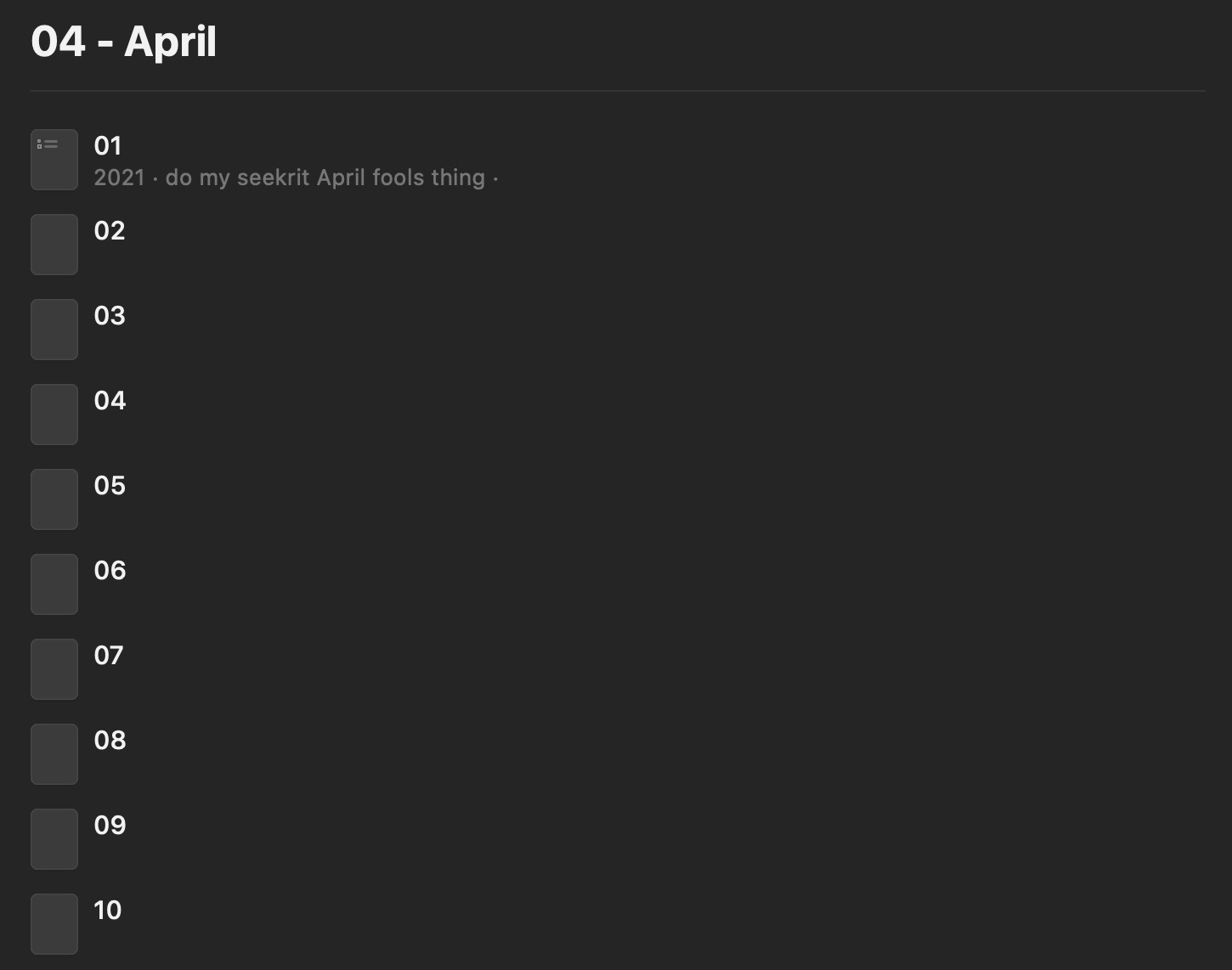
Ok, so what does it look like when we dive into a month? Here’s that April view.

I went ahead and created the 2nd through 10th subpages, so you can see how the month view shows up. There’s nothing particularly exciting about the monthly subpage. It’s just a container.
But, as you can see with April 1st, I’m setup so that there’s a little preview of the top content for each day.
Let’s move on to…
The Day
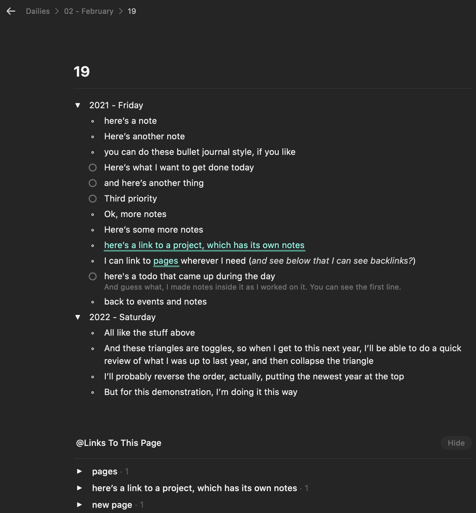
Ok, this is the heart of it, then. Here’s how I might take notes for a day:

Again, a few points to note:
You can see in the upper left the hierarchy of notes I’m “in”. This is in my Dailies page, February subpage, and 19th page.
To get that year-over-year view, I’m using a toggle list feature to create a section for the year (and then for future years). This allows me to open the toggle and review previous years when I first open the note in future years, but then close the toggle to focus on the current date/year.
My notes are a combination of things I want to accomplish, things I’m considering, and micro-journaling of what I do throughout the day.
All of these lines can be subpages themselves (meaning I can go into it and take more notes), or can contain links to other pages, subpages, or blocks within my workspace. I often link to pages I’ve created for projects, people, or topics. (and then on that page I can see backlinks to this reference!)
The tasks can be checked off and completed.
Finally, just as I’ve linked out to other places, I have backlinks inbound to this date from other places. I can follow those links to see the connections.
Not pictured: I can add in-app sketches, scanned notes, documents, or images to my daily page.
Other Factors
I also keep a document that is my intake document, so all items that come in from OSX or iOS sharesheet go there first.
I have templates, including day start, week start, and week end. These include processing that intake inbox, making sure new notes have the correct home, and completing my planning and review activities.
Conclusion
I’m finding this process works very well for me. It’s easy to stick with. It let’s me keep everything in one place. It lets me find and search for what I need, easily. It’s not ugly. It’s fun to work with.
Would something like this work for you? What questions do you have?
-
Note: the 2nd and 3rd spaces will move to “Craft Connect” and “offline spaces” for additional privacy and control, when those become available in the near future. ↩︎
-
Though as with much in Craft, you can edit how things are visualized, more-so even than in some word-processing documents, and including in some ways that are unique to Craft. ↩︎
-
You can’t see unlinked references to a page, yet, but this is a feature they are considering. ↩︎